IsItFedoraRuby new design
~4 min read • in opensourceThe past week I tried to do something about the looks of isitfedoraruby. It was fun using bootstrap (my first time) and I think the outcome is cool. I tried to use Fedora like colors and the font is Liberation Sans, same as Fedora pkgdb.
You can check the overall changes:
- Before: https://www.isitfedoraruby.com/
- After: https://fedoraruby.axilleas.me/
Tables
They are now borderless, with highlighted headings. They are also responsive which means if the table is bigger than the page it gets its own sidebar without breaking the rest of the site.
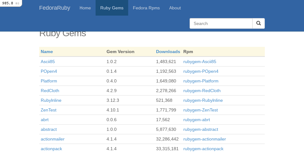
fedorarpms
index page
The index page show all packaged rubygems along with some interesting info. You can see if a package is out of date if is highlighted with a red color. On the other hand green means is up to date with latest upstream.
The code that does that is pretty simple. Bootstrap provides some css classes
for coloring. So I wanted to use warning for outdated and success for up to
date packages. I highlighted the whole table row so I used:
%tr{class: rpm.up_to_date? ? 'success' : 'danger'}
In particular check line 19.
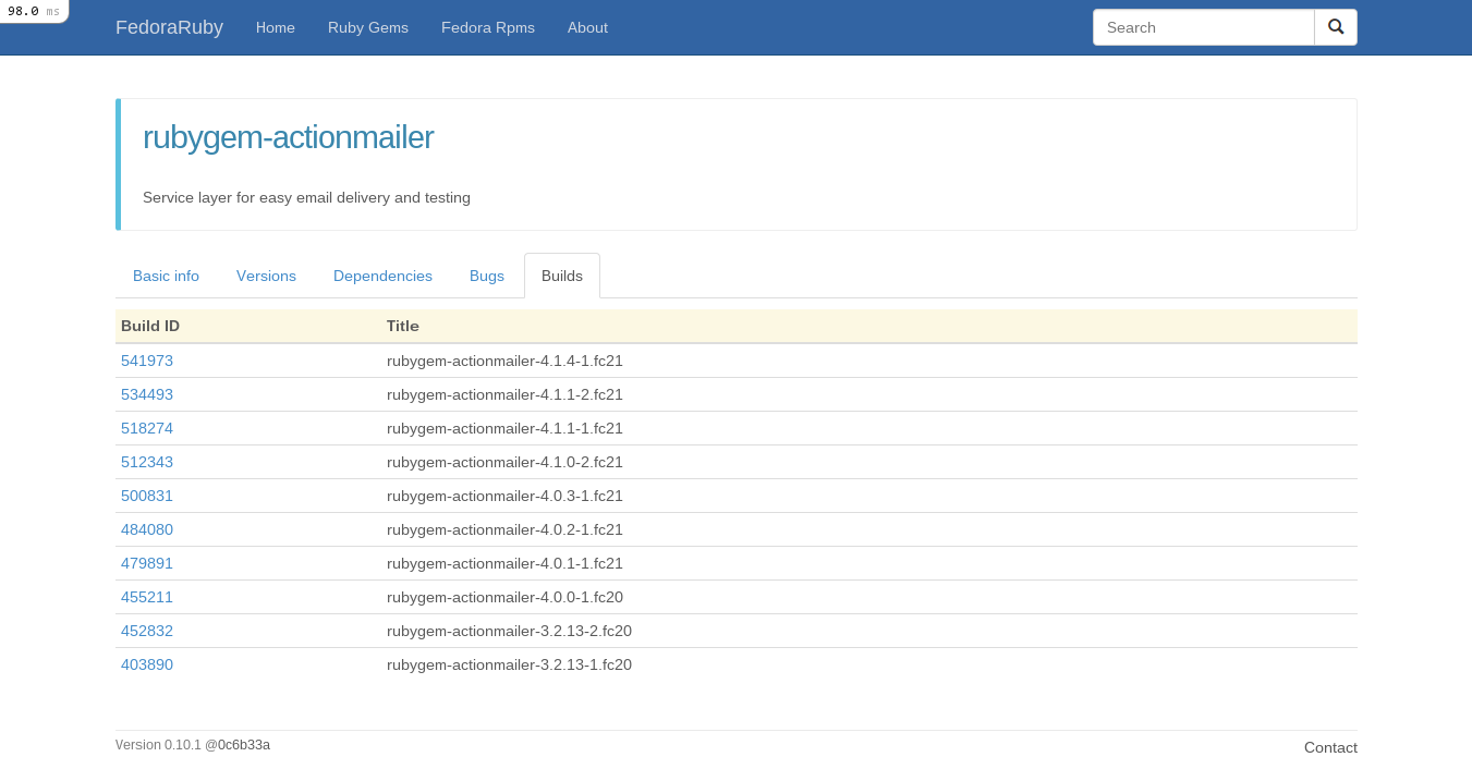
show page
Previously there was a ton of information all in one page. Now, the info is still there but I have devided it into tab sections.
Currently there are 5 tabs.
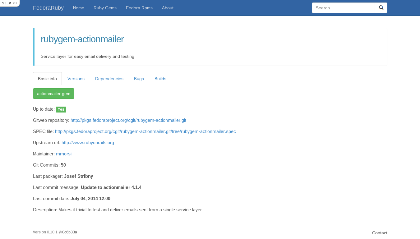
The main tab has a gem's basic info:
- Up to date badge (green yes or red no)
- Gitweb repository url
- SPEC file url
- Upstream url
- Maintainer FAS name
- Number of git commits
- Last packager (in case a package is co-maintained)
- Last commit message
- Last commit date
- Description
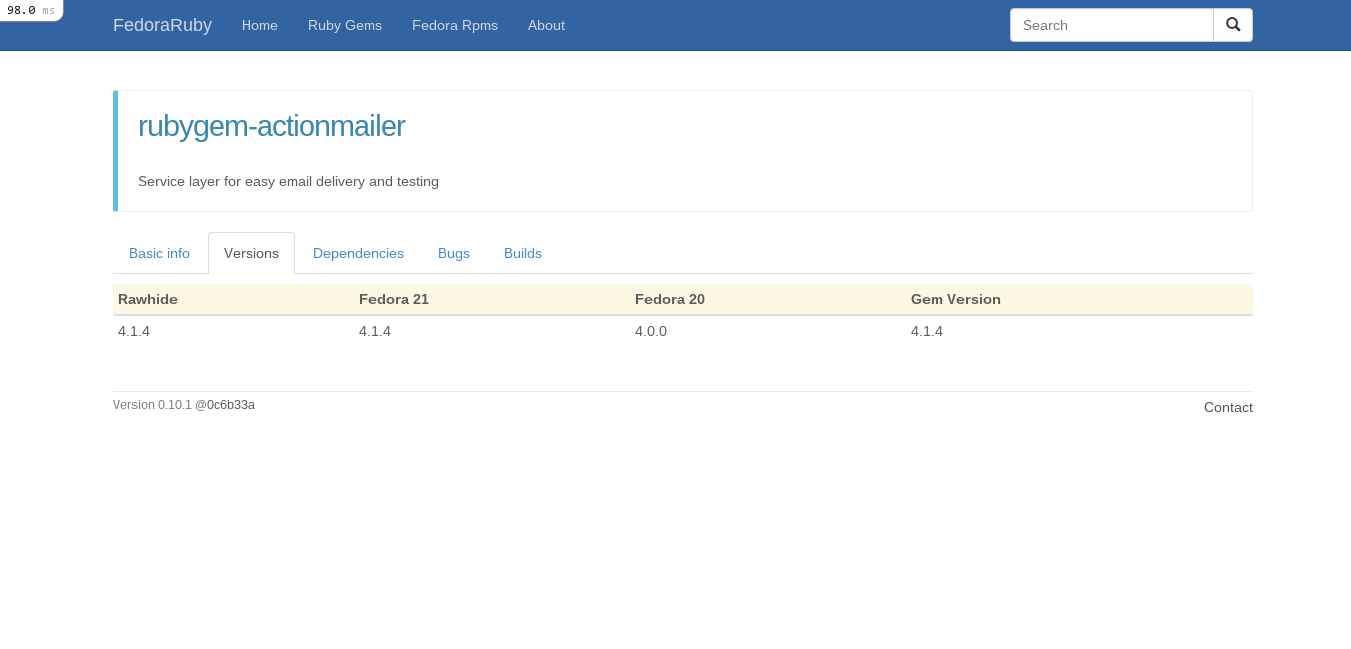
Then there is a tab about version information:
- Table with gem versions across supported Fedora versions (rawhide, 21, 20)
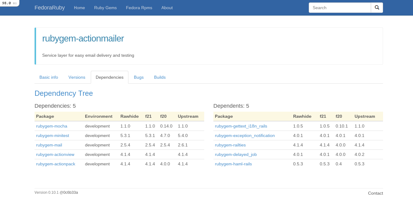
Another important tab is a list with a packages's dependencies:
- One table with dependencies with column whether they are runtime/development deps
- One table with dependents packages
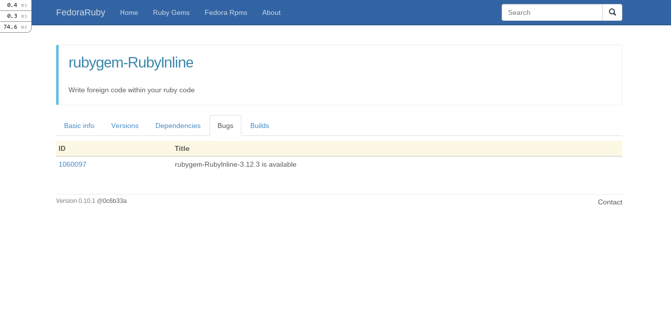
The bugs tab depicts all of package's open bugs for Fedora in a table.
And lastly koji builds for only the supported Fedora versions.
rubygems show page
The description is now on top of the page. Instead of one column, the new look has two columns, one for basic info and one for the depdendencies table.
Compare rake:
- Before : https://www.isitfedoraruby.com/rubygems/rake
- After : https://fedoraruby.axilleas.me/rubygems/rake
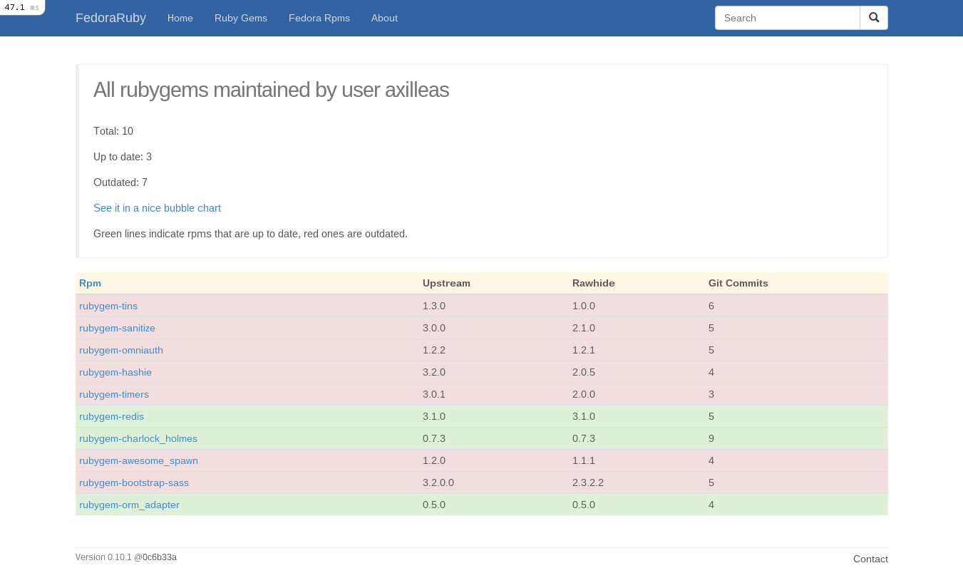
owner page
I added some info on top of the page about the number of the packages a user owns:
- Total
- Up to date
- Outdated
The table that has an owner's packages is also highlighted to depict outdated and up to date packages.
Here's an embarassing screenshot which reminds me I have to update my packages...
Navigation bar
The navigation bar was a PITA to configure and make as responsive as possible. There were a lot of bits and pieces needed to fit together, here are some of them.
Active links
I used a helper method which I found in this so answer.
Navbar header
I used the same colors of Fedora pkgdb. With the help of a firefox extension named colorpicker and https://twbscolor.smarchal.com/ I gave the navbar the color it has now. twbscolor is a cool site that extracts your chosen color even in scss, which I used along with some minor tweaks.
Dropdown menu
In responsive mode there is a dropdown menu. That requires some javascript and the steps are:
1.Add *= require bootstrap in app/assets/stylesheets/application.css
2.Add //= require bootstrap in app/assets/javascripts/application.js
3.Add in app/assets/javascripts/application.js:
$('#header-collapse').collapse({
  toggle: false
})
4.Add bootstrap classes to header view:
%header.navbar.navbar-default.navbar-fixed-top
  .container
    .navbar-header
      %button.navbar-toggle{ type: 'button', data: {toggle: 'collapse', target: '#header-collapse'}}
        %span.sr-only 'Toggle navigation'
        %span.icon-bar
        %span.icon-bar
        %span.icon-bar
        %span.icon-bar
      = link_to 'FedoraRuby', root_path, class: 'navbar-brand'

    %nav.collapse.navbar-collapse#header-collapse{role: 'navigation'}
      %ul.nav.navbar-nav
        %li{class: is_active?(root_path)}
          = link_to _('Home'), root_path
        %li{class: is_active?(rubygems_path)}
          = link_to _('Ruby Gems'), rubygems_path
        %li{class: is_active?(fedorarpms_path)}
          = link_to _('Fedora Rpms'), fedorarpms_path
        %li{class: is_active?(about_path)}
          = link_to _('About'), about_path
Search field
I wanted the search field to be together with the search button. In bootstrap this is accomplished with input-group-buttons. The final code was:
%ul.nav.navbar-nav.navbar-right
  %li
    = form_tag( { :controller => 'searches', :action => 'redirect' },
    :class => 'navbar-form', :method => 'post') do
      .input-group
        = text_field_tag :search, params[:search] ||= '',
            class: 'search-query form-control',
            placeholder: 'Search'
        %span.input-group-btn
          = button_tag raw('<span class="glyphicon glyphicon-search"></span>'), name: nil, class: 'btn btn-default'
Instead for a search button with text, I used an icon.
There was also another problem regarding responsiveness. In different page sizes the header looked ugly and the search bar was getting under the menu.
I fixed it by adding a media query in custom.css.scss that disappears the
logo in certain widths.
@media (min-width: 768px) and (max-width: 993px) {
  .navbar-brand {
    display: none
  }
}
Here are before/after screenshots to better understand it.
Responsive design
Bootstrap comes with responsiveness by default. In order to activate it you have
to add a viewport meta tag in the head of your html, so in
app/views/layouts/application.html.haml add:
%meta{ :content => "width=device-width, initial-scale=1, maximum-scale=1", :name => "viewport" }
See full application.html.haml
It sure was fun and I learned a lot during the process of searching and fixing stuff :)